(Because We’ve All Been Staring at Our Walls Too Much)
February in Boulder has a personality. One day it’s bright and sunny and you’re convinced spring is close. The next day there’s snow on the foothills again and you’re back inside, staring at the same walls you’ve been staring at since November. That’s usually when paint colors start getting extra attention. Not because anything suddenly looks terrible. More because you’ve had time to notice… everything.
People tell me this is the month when walls quietly lose their charm.
So instead of pretending paint trends don’t matter while very much thinking about them, let’s talk through the paint color trends lining up to shape 2026. No design lectures. No pressure to repaint right now. Just color ideas that actually make sense for Boulder homes and don’t fall apart once the seasons flip again.
Why 2026 Paint Colors Work Well in Boulder Homes
I’ve noticed homeowners here are leaning toward colors that feel flexible. Boulder gets intense sunlight, dry air, snow-bright reflections, and long stretches of blue sky. A color has to behave well in all of that or it gets old fast.
Interior painters in Boulder CO are already seeing people gravitate toward shades that don’t feel washed out in strong sun and don’t feel dull during cloudy winter days. That balance matters more at elevation.
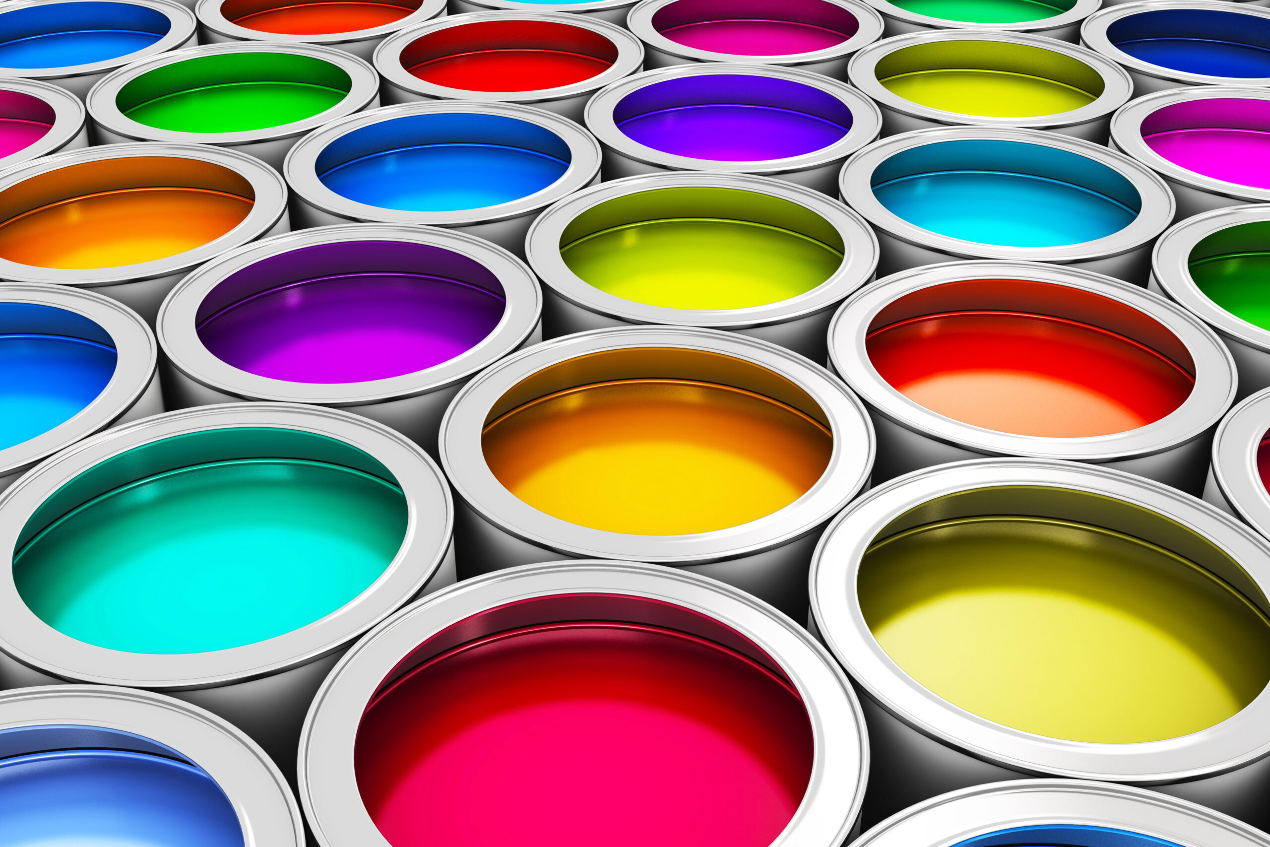
Let’s break down the 12 colors people keep circling back to.
1. Warm Neutrals That Don’t Feel Washed Out
Cool gray is fading, slowly but surely.
Warm neutrals like soft cream, light sand, and cozy beige are stepping in because they hold warmth without turning yellow in bright sunlight. In Boulder homes with lots of natural light, that matters.
These colors feel calm without being boring, which is harder than it sounds.
2. Muted Greens That Feel Grounded
Soft greens are sticking around, and they make a lot of sense here.
These aren’t bold or trendy greens. They’re muted, slightly dusty shades that feel connected to the outdoors without copying it exactly. They work well in bedrooms, offices, and bathrooms.
3. Dusty Clay and Soft Peach Tones
This one always gets a pause.
The 2026 versions of clay and peach are toned down and subtle. These colors add warmth without overpowering a room and work especially well in spaces that feel a little cold during winter months.
4. Deep Blues That Handle Strong Sunlight
Moody blues are still popular, but they’ve softened just enough.
These blues hold their depth even in strong Colorado sunlight, which keeps them from feeling faded. They work well as accent walls or in rooms where you want contrast without heaviness.
5. Earthy Terracotta That Feels Natural
Terracotta has settled into a calmer version of itself.
Instead of bold orange tones, these colors feel earthy and warm. They pair nicely with wood floors, natural textures, and neutral furniture common in many Boulder homes.
6. Mushroom and Greige That Adapt Easily
These colors don’t ask for attention, and that’s why people like them.
Mushroom tones and greige shades shift with the light throughout the day. Morning brightness, afternoon glare, evening shadows. They handle all of it without feeling flat.
7. Warm Browns That Feel Intentional
Brown is quietly making a comeback.
Modern browns feel cozy and grounded without feeling heavy. Think soft walnut or cocoa tones that add depth without darkening a room too much. Great for offices, dens, and bedrooms.
8. Dusty Lavender (The Unexpected One)
This one surprises people every time.
Dusty lavender isn’t purple in the obvious way. It’s soft, slightly gray, and calming. It works well in bedrooms and bathrooms where you want something gentle but not plain.
9. Warm Charcoal Instead of Black
Black walls still feel intimidating. Warm charcoal feels more approachable.
These shades add contrast without making rooms feel closed in, especially when paired with lighter trim and good lighting.
10. Creamy Whites That Don’t Glare
Bright white can feel harsh at elevation.
Creamy whites with warmth built in feel softer in strong sunlight and don’t bounce glare around the room. They’re also more forgiving with everyday wear.
11. Sage Gray That Changes With the Light
Sage gray keeps showing up because it adapts.
It looks slightly different depending on the time of day, which keeps it interesting and makes it a solid choice for shared living spaces.
12. Misty Blues That Feel Clean and Calm
Soft blues are light, relaxed, and easy to live with. They’re popular in bathrooms and bedrooms where people want a clean feel without going cold.
How These Colors Hold Up in Boulder Weather
Boulder homes deal with big light shifts. Snow-bright winters, intense summer sun, and dry air year-round. These 2026 colors were chosen because they stay consistent through all of it and don’t depend on perfect conditions.
Common Color Mistakes Homeowners Still Make
A few patterns come up again and again:
- Choosing colors under store lighting only
- Skipping test patches
- Forgetting how strong sunlight affects tone
- Ignoring sheen differences
Paint behaves very differently on real walls.
A Helpful Colorado Resource
For general homeowner guidance and safety information in Colorado, this is a useful reference:
https://cdle.colorado.gov
A Comfortable Way to Wrap This Up
Trends are fun, but the right paint color should still feel good long after February ends. Whether you repaint this year or just start paying attention, these 2026 colors give you options that won’t feel outdated anytime soon. And if you ever want help testing colors, talking through ideas, or getting paint on the walls without second-guessing everything, Green Sage Painting and other experienced residential painters around Boulder are always there as a steady resource. No pressure. Just help when you want it.